*Many of my clients have kids in high school/college. This series of posts detailing the key points of an effective early career job/internship search is for them! If your child needs a resume, reach out. I offer discounted student rates.
First Impressions Happen Fast
Imagine walking into an interview wearing a wrinkled suit with mismatched socks. You might be the best candidate for the job, but the hiring manager is already distracted by your appearance.
Your resume works the same way.
Before anyone reads a single word about your skills or experience, they see your resume. If it’s cluttered, difficult to skim, or formatted in an unconventional way, you could lose their attention before they even start reading.
So, let’s talk about how to make your resume look polished, professional, and easy to digest.
Stick to the Right Tools
Not all resume-building software is created equal. If you’re using Canva, Photoshop, or Apple Pages, you might be setting yourself up for failure.
✅ Best options: Microsoft Word (.docx) or Google Docs – ATS-friendly, widely accepted, and easy to update.
❌ Avoid: Pages (doesn’t play well with Windows), PDFs from design software (often unreadable by ATS), and overly creative layouts.
Why? Because Applicant Tracking Systems (ATS)—the robots scanning your resume before a human does—often struggle to read non-standard formatting. If your resume gets jumbled in an ATS, it won’t even reach a recruiter’s desk.
❌ Avoid: Formats with photos (in the US) – due to equal opportunity laws (EEO), Human Resources tends to send resumes with photos directly to the recycle bin.
The Golden Rules of Resume Formatting
1️⃣ Keep It Simple
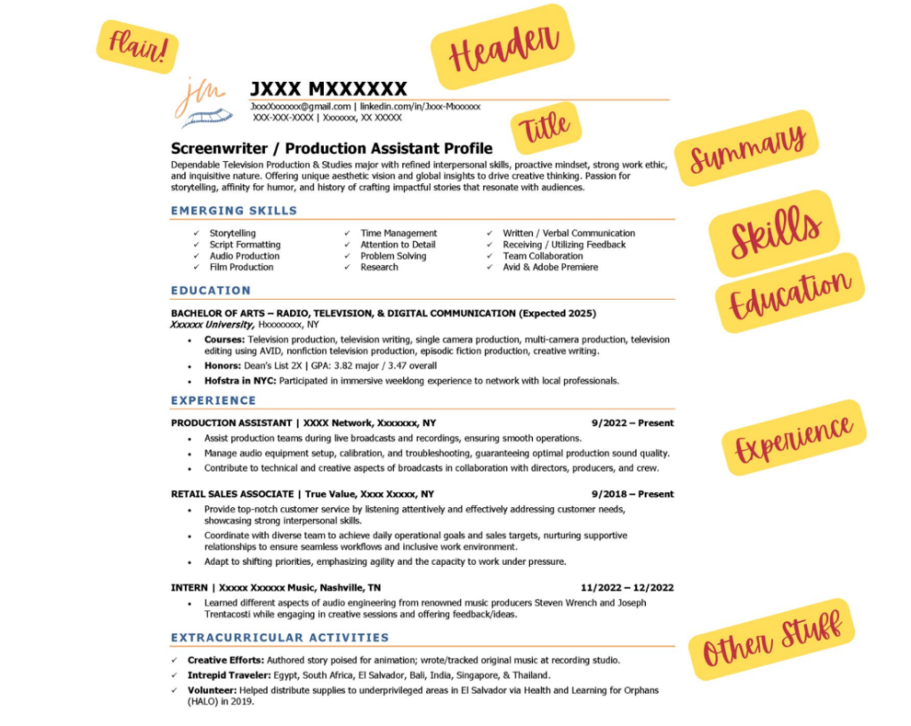
Your resume should be easy to scan at a glance. Stick to a clean, single-column layout with clear section headings.
✅ Best practices:
- Use 10.5-11 pt font (Try Calibri, Carlito, or Aptos).
- Keep at least .5-inch margins on all sides.
- Use bold or ALL CAPS for section headers rather than fancy fonts.
2️⃣ Ditch the Fancy Design Elements
Graphics, multiple columns, and text boxes might look great, but they confuse ATS software and frustrate recruiters.
❌ Avoid:
- Multiple-column layouts
- Company logos
- Headshots/photos
- Infographics or rating bars for skills
- Fancy fonts or excessive color
3️⃣ Bullet Points Are Your Best Friend
Recruiters skim resumes in under 10 seconds—long paragraphs won’t cut it.
✅ Use bullet points to highlight key achievements:
- Increased social media engagement by 40% in six months.
- Managed $5K budget for student government events.
4️⃣ Page Length: 1 (Maybe 2) is Enough
If you’re a student or recent grad, your resume will most likely fit on one page.
❌ Don’t stretch it out with unnecessary details.
✅ When is a two-page resume okay? If you have to list multiple jobs or internships, research projects, or leadership roles that will stretch beyond the first 1/3 of the second page, it’s ok to have a two-page resume.
5️⃣ Save It Right!
Your resume should be universally accessible across devices and systems.
✅ Best practice: Save your resume as a .docx file (Word) and only convert it to a PDF if required by the employer.
❌ Avoid Apple Pages, PNGs, or anything other than Word or PDF.
Final Thoughts: Keep It Polished, Keep It Professional
Formatting may seem like a small detail, but it’s the first impression a hiring manager gets of you. A well-structured, clean, and readable resume makes it easier for both ATS and recruiters to quickly see your value—which is exactly what you want.
Need help fine-tuning your resume formatting? Let’s chat! Visit my website for expert resume advice.
